

The Best Squarespace Hamburger Menu Plugin in 2026 - Fullscreen, Auto Colors, No Coding

If you have ever looked at a beautifully minimal website where a single hamburger icon opens a stunning fullscreen overlay complete with images, your latest blog posts, products, and social links you have probably wondered how to build something like that on Squarespace.
The answer is simpler than you think. And faster.
This guide covers everything you need to know about Squarespace hamburger menu plugins in 2026: what they are, what options exist, why most of them fall short, and which one delivers a professional result without any design work.
What Is a Squarespace Hamburger Menu?
The hamburger menu gets its name from the three horizontal lines that represent it stacked like a burger, a patty between two buns. On mobile devices, Squarespace uses the hamburger icon natively to hide navigation behind a tap.
The problem is that Squarespace's default hamburger menu is basic. It opens a plain list of your pages. There are no images. No layout. No columns. No brand personality. On desktop, Squarespace does not use a hamburger menu at all it shows your full navigation in the header.
In 2026, visitors expect more.
A premium hamburger menu on Squarespace should:
Open a fullscreen overlay when clicked on both desktop and mobile
Show images from your pages, not just text links
Display your latest blog posts and products automatically
Match your site's color scheme without any manual setup
Include your logo, social media icons, and a call-to-action button
Animate beautifully staggered entrance, smooth transitions, hover effects
Squarespace 7.1 cannot do any of this natively. To get a professional hamburger menu on Squarespace, you need a plugin.

Why Most Squarespace Hamburger Menu Plugins Fall Short
Before recommending the best option, it is worth understanding what is available and why most options disappoint.
CSS Only Approaches Basic and Fragile
The most common solution you will find when searching "Squarespace hamburger menu on desktop" is a CSS snippet that forces the mobile navigation to appear on all screen sizes. A typical example looks like this:
.header-nav { display: none; }
.header-burger { display: flex; }
.header--menu-open .header-menu { opacity: 1; visibility: visible; }
This technically works it hides your regular nav and shows the mobile burger on desktop. But what opens when someone clicks it? Squarespace's default mobile menu: a plain text list with no images, no columns, no design.
CSS-only approaches also break when Squarespace updates its code. Squarespace changed its navigation structure in 2025 and many CSS hacks stopped working overnight. If you are running a client site or a business, having your navigation suddenly break is not acceptable.
CSS-only hamburger menus: no images, no content panels, no auto colors, breaks with updates.
Monthly Subscription Tools Expensive Long-Term
Many offer hamburger menu customization as part of their broader Squarespace design toolkits. Plugin starts at $9 per month and run from $12 to $69 per month.
These are ongoing commitments. A site you build today will cost you $108–$828 per year just to maintain a hamburger menu. For an agency managing 10 client sites, that adds up to thousands of dollars annually.
Additionally, neither tool delivers a fullscreen overlay with automatic image fetching, automatic color detection, or an auto-populated blog and shop panel. They show your navigation links in an overlay. They let you change the colors. That is the extent of it.
Monthly subscription tools: recurring fees, no auto content, limited to styling what already exists.
Basic One Time Plugins Slide Outs With No Content
Many offers a slide out hamburger menu a CSS based version for $25. Both are slide out panels a panel slides in from one side of the screen when the hamburger is clicked.
These are functional, but they show a text list of your navigation items. No images. No blog posts. No shop products. No social icons. The slide-out style also feels dated compared to modern fullscreen overlays.
Basic slide-out plugins: functional but visually minimal, no rich content.
The Squarespell Hamburger Mega Menu Built Differently
The Squarespell Hamburger Mega Menu Plugin takes a completely different approach. Instead of asking you to build your menu content, it reads your existing Squarespace site and builds the menu automatically.
When a visitor clicks the hamburger icon, a fullscreen overlay opens with a three-column layout:
Left column Navigation.
Your existing Squarespace pages and folders appear as animated navigation items. Each item has an automatically selected icon, a name, and a subtitle. The currently active page is highlighted. Items animate in with a staggered effect when the menu opens.
Center column Content.
This is where the plugin truly separates itself. Folders in your navigation become image card grids the plugin fetches photos from each linked page automatically using the Squarespace API. Blog pages show your latest posts with thumbnails, dates, and article labels. Shop pages show your latest products with images and prices.
Right column Aside.
A featured latest blog post with a full image card, a featured latest shop product, and a Quick Access list of important pages.
At the bottom a custom scrolling ticker. Edit the text to match your brand.
Everything in the overlay adapts to your site. The plugin reads your Squarespace CSS variables — background color, text color, button style, heading font, body font and applies them throughout the menu. Install it on a dark site and it looks perfectly dark. Install it on a light site and the overlay matches. Install it on a bold orange or navy site and it adapts instantly.
You do none of this manually. It all happens automatically.
What Makes It Different From Every Other Option
The Squarespell Hamburger Mega Menu is the only Squarespace hamburger menu plugin that:
Fetches images automatically no manual image uploads or selection required
Detects your site colors automatically reads your Squarespace CSS variables and adapts the entire overlay
Shows your blog and shop content automatically latest posts and products appear without any configuration
Reads your social media links automatically displays them with correct brand colors (Facebook blue, Instagram, YouTube red, etc.)
Includes a fullscreen three-column layout not a text list, not a slide-out panel
Replaces Squarespace's mobile menu with a custom accordion folders expand with animated image grids on phones and tablets
Is a one-time purchase $25 for a single site, no subscriptions, no monthly fees
How to Install the Squarespace Hamburger Mega Menu in 2 Minutes
What You Need Before Starting
A Squarespace 7.1 site on a Business plan or higher (required for Code Injection)
Your existing Squarespace navigation set up with pages and folders
The Squarespell Mega Menu Plugin 2 minutes of your time
The Only Squarespace Hamburger Menu That Fills Itself With Your Content Automatically
Fullscreen 3-Column Overlay nav panel, image content center, featured aside premium on every screen
Zero Configuration installs from your existing Squarespace navigation, nothing to rebuild
Auto Color Detection reads your theme, adapts overlay background, text, borders, and fonts instantly
Auto Image Fetching retrieves photos from your pages via the Squarespace API automatically
Blog Panel shows your latest posts with thumbnails, dates, and article labels automatically
Shop Panel shows your latest products with images and prices automatically
Scrolling Ticker animated message bar at the bottom, fully editable for your brand
CTA Button your actual Squarespace header button, colors matched automatically
Mobile Accordion on phones, folders expand with animated image grids inside each section
Works on Every Template Fluid Engine, all 7.1 templates, dark/light/colored headers
One-Time Purchase no subscriptions, no monthly fees, no renewals
2-Minute Install paste Header code, paste Footer code, save. Done.
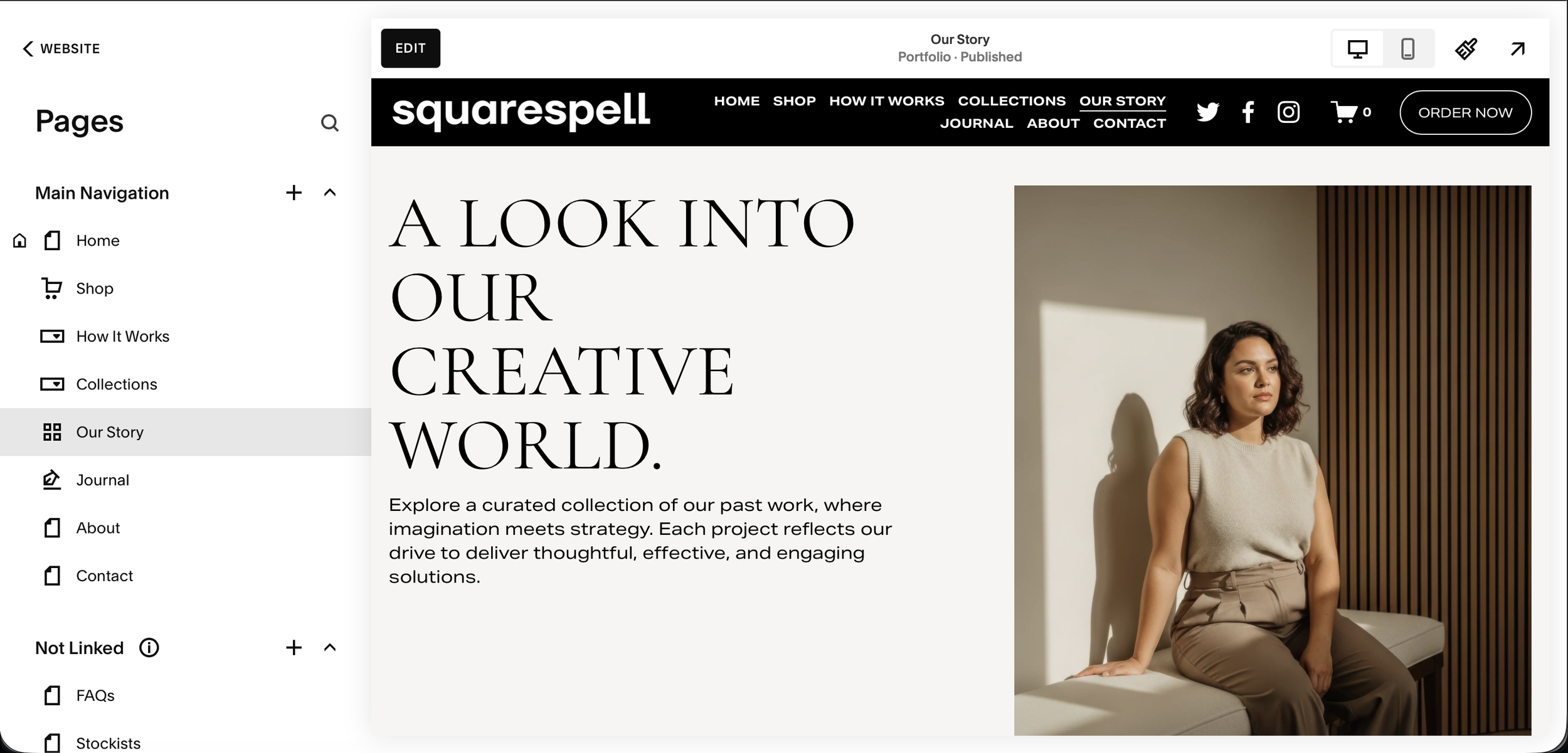
Step 1: Open Your Squarespace Website
Log into Squarespace and open your website. This plugin works on any Squarespace 7.1 template colors, fonts, and layout adapt automatically to your site.
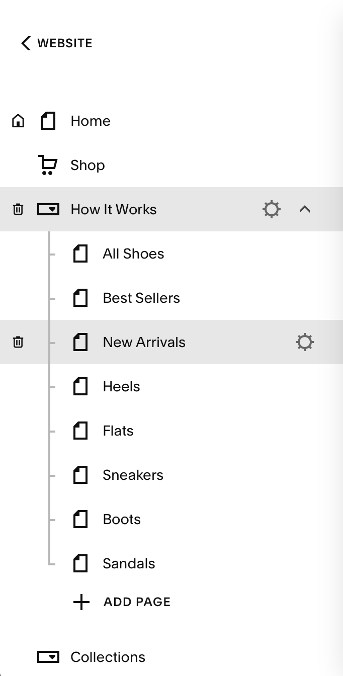
Step 2: Review Your Navigation Structure
Open the Pages panel. Folders become image card dropdowns. Regular pages get a hero image panel. Blog and Shop pages show item grids with thumbnails and prices.
Step 3: Note Your Header Color
Click your header to view its color theme. The plugin reads your site colors automatically dark header gets light text, light header gets dark text. No manual setup.
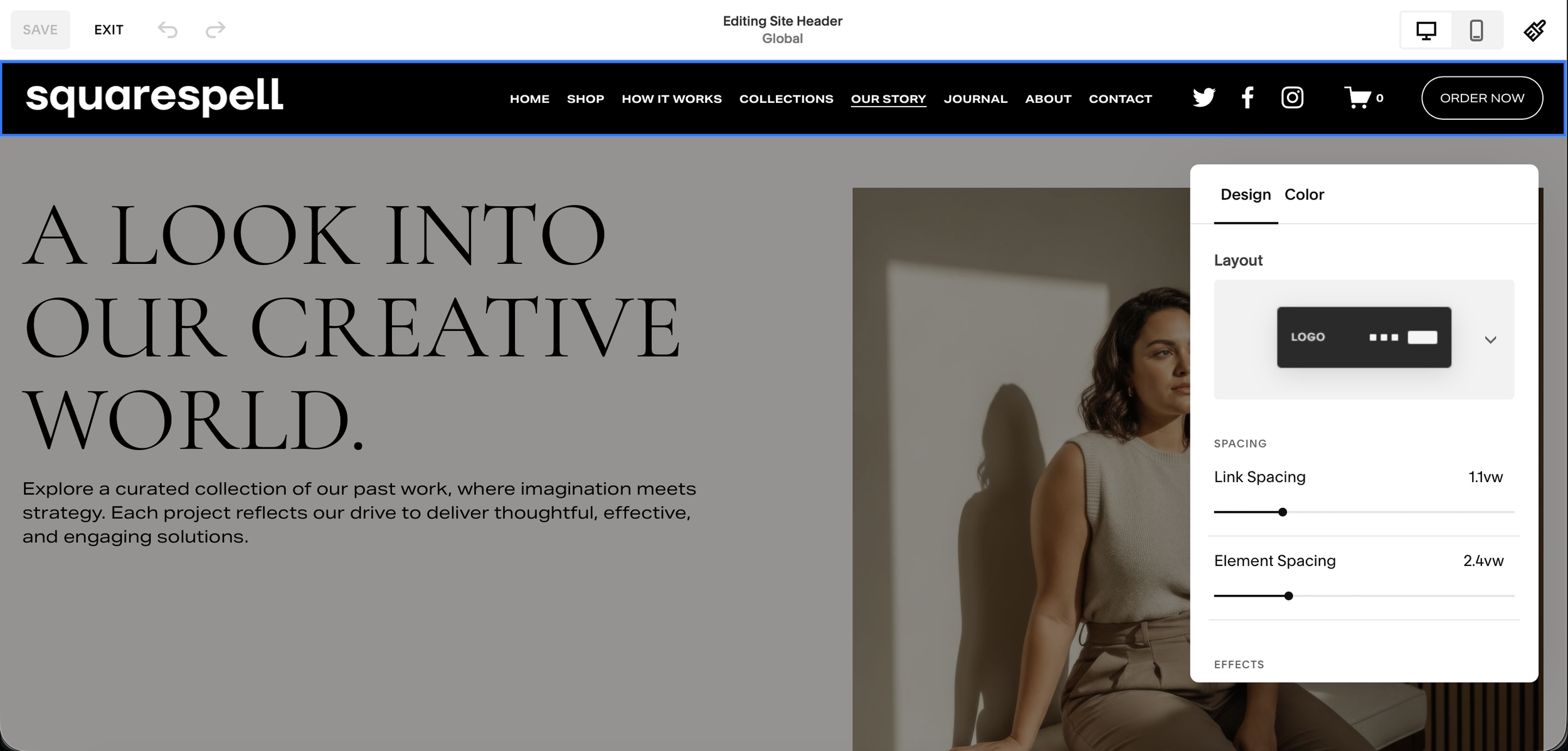
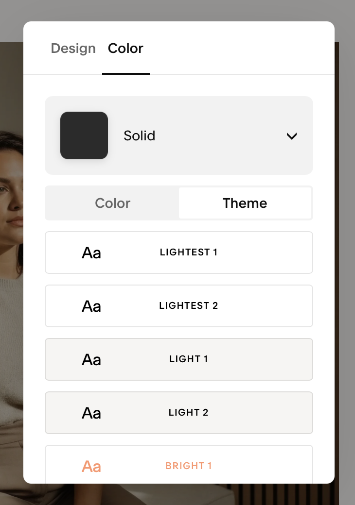
💡 Works with dark, light, and any colored header automatically.
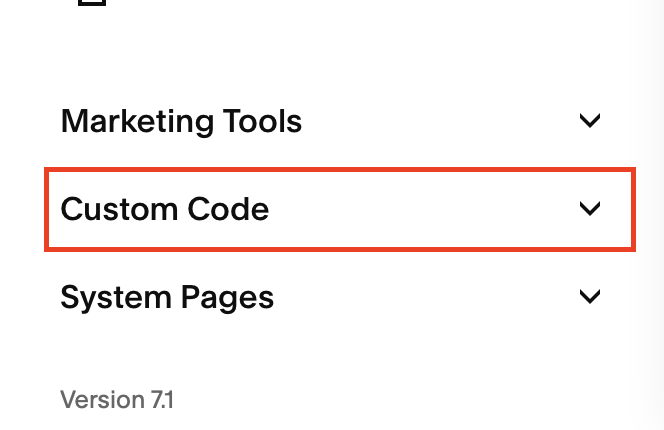
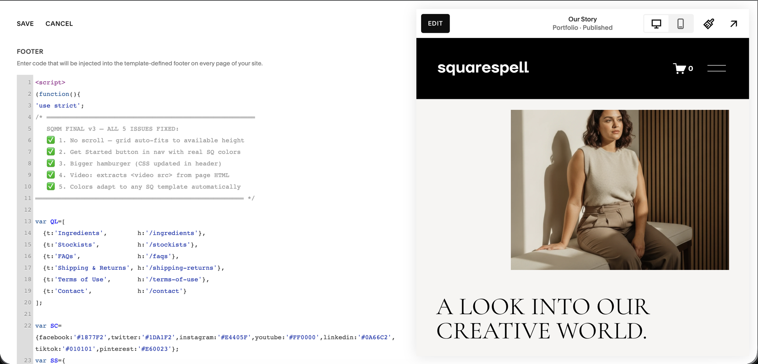
Step 4: Open Code Injection in Squarespace
Log into your Squarespace account and go to your website dashboard.
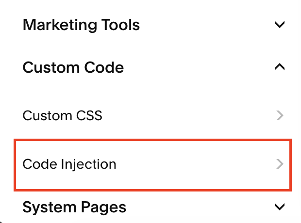
In the left sidebar, scroll past your pages list until you see Custom Code at the bottom. Click it to expand the section, then click Code Injection.
Navigation path: Pages sidebar → scroll down → Custom Code → Code Injection
You will see two text boxes: Header at the top and Footer at the bottom.
Step 5: Paste the Header Code
Click inside the Header box. Select all existing content and delete it.
Open the installation guide that came with your purchase. Copy the full Header code block (the one labeled "CSS + HTML") and paste it into the Header box.
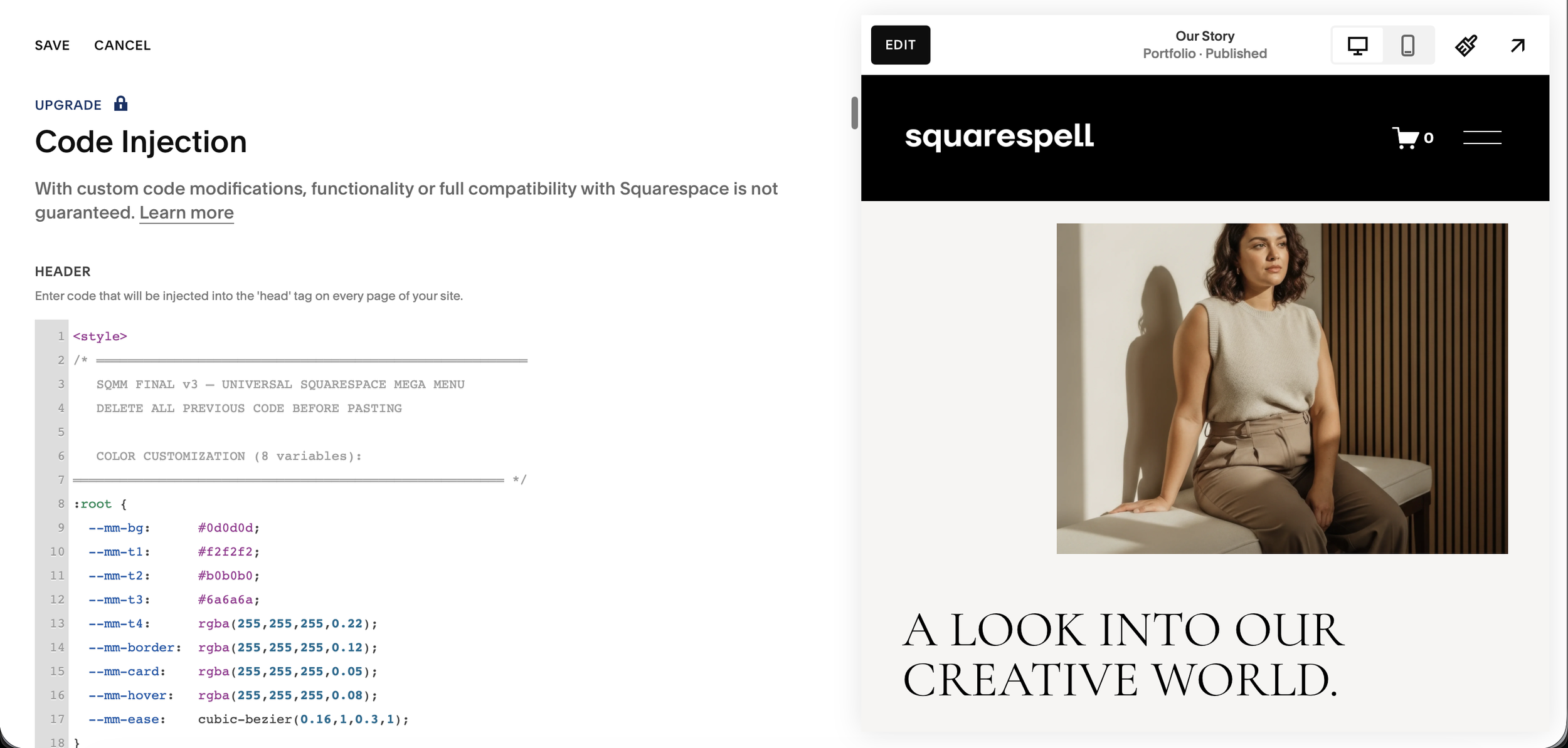
This code block contains:
All CSS styles for the desktop dropdown panels
CSS styles for the mobile fullscreen menu
The HTML structure for both menus
Responsive rules that hide the desktop panel on mobile and vice versa
⚠️ Delete ALL existing content in the Header box before pasting. If there is existing code from another plugin, paste below it on a new line do not replace the entire box unless the other code is no longer needed.
Step 6: Paste the Footer Code
Scroll down to the Footer box. Select all existing content and delete it.
Copy the Footer code block (the one labeled "JavaScript") from your installation guide and paste it into the Footer box.
This code block contains the complete JavaScript logic:
Theme detection (reads your Squarespace colors)
Navigation item detection (reads your pages and folders)
Image fetching (retrieves photos from your pages automatically)
Event listeners for hover, click, and touch interactions
Mobile menu behavior
⚠️ Same rule applies if you have other footer code running, paste on a new line below it rather than replacing.
Step 6: Save and Preview
Click Save at the top of the Code Injection page.
Open your website in a new browser tab (do not preview from the editor open the live site URL).
On desktop, hover slowly over any navigation item. The mega menu panel should slide down smoothly. Hover over a folder to see image card panels. Click anywhere outside to close.
On mobile (or narrow your browser window to under 900px), you should see a hamburger icon appear in your header. Tap or click it to open the fullscreen mobile menu.
The Only Squarespace Hamburger Menu That Fills Itself With Your Content Automatically
Fullscreen 3-Column Overlay nav panel, image content center, featured aside premium on every screen
Zero Configuration installs from your existing Squarespace navigation, nothing to rebuild
Auto Color Detection reads your theme, adapts overlay background, text, borders, and fonts instantly
Auto Image Fetching retrieves photos from your pages via the Squarespace API automatically
Blog Panel shows your latest posts with thumbnails, dates, and article labels automatically
Shop Panel shows your latest products with images and prices automatically
Scrolling Ticker animated message bar at the bottom, fully editable for your brand
CTA Button your actual Squarespace header button, colors matched automatically
Mobile Accordion on phones, folders expand with animated image grids inside each section
Works on Every Template Fluid Engine, all 7.1 templates, dark/light/colored headers
One-Time Purchase no subscriptions, no monthly fees, no renewals
2-Minute Install paste Header code, paste Footer code, save. Done.
The Hamburger Mega Menu vs the Hover Dropdown Mega Menu — Which Do You Need?
Squarespell offers two distinct navigation plugins for Squarespace 7.1. Understanding the difference helps you choose the right one — or use both together.
Squarespell Hover Dropdown Mega Menu
The hover dropdown replaces Squarespace's standard navigation links with rich dropdown panels that appear when visitors hover over navigation items. Your full navigation bar remains visible in the header. Hovering over any item opens a panel below it.
This is the better choice for:
Sites where the navigation items need to be always visible in the header
E-commerce sites where you want product categories to feel immediately accessible
Content-heavy sites where visitors need to see all sections at a glance
Professional service sites where a clean, structured navigation is important
The hover dropdown is explored in full detail in the guide:

The Only Squarespace Mega Menu That Installs Itself
Paste two code snippets into Code Injection. Your existing navigation instantly transforms into a premium mega menu no design work, no CSS variables, no Squarespace block building required.
Zero Configuration your existing nav links become the menu automatically
Auto Color Detection reads your Squarespace theme, adapts to any site color
Auto Image Fetching fetches your page images automatically, no manual uploads
Mobile Fullscreen Menu premium custom mobile overlay, not Squarespace's basic menu
Hover Dropdown smooth animated panels appear on desktop hover
Works on ANY Template Fluid Engine, classic 7.1, dark, light, colored headers
2-Minute Install paste Header code, paste Footer code, save. Done
The Only Squarespace Hamburger Menu That Fills Itself With Your Content Automatically
Fullscreen 3-Column Overlay nav panel, image content center, featured aside premium on every screen
Zero Configuration installs from your existing Squarespace navigation, nothing to rebuild
Auto Color Detection reads your theme, adapts overlay background, text, borders, and fonts instantly
Auto Image Fetching retrieves photos from your pages via the Squarespace API automatically
Blog Panel shows your latest posts with thumbnails, dates, and article labels automatically
Shop Panel shows your latest products with images and prices automatically
Scrolling Ticker animated message bar at the bottom, fully editable for your brand
CTA Button your actual Squarespace header button, colors matched automatically
Mobile Accordion on phones, folders expand with animated image grids inside each section
Works on Every Template Fluid Engine, all 7.1 templates, dark/light/colored headers
One-Time Purchase no subscriptions, no monthly fees, no renewals
2-Minute Install paste Header code, paste Footer code, save. Done.
Squarespell Hamburger Mega Menu
The hamburger menu replaces the standard navigation bar entirely with a single hamburger icon. Clicking it opens a fullscreen overlay. Your header becomes clean and minimal just your logo and the hamburger button.
This is the better choice for:
Minimal, editorial, or portfolio sites where a clean header is important
Creative agencies and studios that want a distinctive navigation experience
Sites with many navigation items that would clutter a standard header
Brands that want consistent navigation on desktop and mobile
Designers who want a dramatic, immersive menu moment
Can You Use Both?
The two plugins are separate products designed for different navigation approaches. Most sites choose one. However, if you have specific pages under hover dropdowns and want a hamburger for the mobile experience separately, they can technically coexist. Contact info@squarespell.com if you want guidance on your specific setup.
Frequently Asked Questions
-
Squarespace 7.1 only shows the hamburger icon on mobile by default. To add it on desktop, you have three options: add CSS code to force the mobile menu on desktop (basic text list, no images, breaks with Squarespace updates), use a monthly subscription tool like Spark Plugin or SquareKicker, or install a dedicated plugin like the Squarespell Hamburger Mega Menu which gives you a fullscreen overlay with images, blog content, and auto-matching colors in 2 minutes.
-
With the Squarespell Hamburger Mega Menu, no. The installation is two copy-paste steps into Code Injection paste the Header code, paste the Footer code, save. Most customers are done in under 2 minutes. No CSS, no variables, no block building.
-
Yes uniquely, the Squarespell plugin reads your Squarespace CSS variables at load time. It detects your background color, text color, button style, heading font, and body font and applies them throughout the overlay. A dark site gets a dark overlay. An orange site gets an orange-tinted overlay. This is not available in any other Squarespace hamburger menu plugin.
-
No. The plugin fetches images from your pages automatically using the Squarespace API. When the menu opens, it retrieves the hero image from each of your linked pages and displays them as cards. Blog posts and shop products also have their thumbnails pulled automatically.
-
Yes. On mobile, the overlay opens as a fullscreen accordion menu. Folders expand with animated image card grids. Your logo, social icons, and CTA button are all included. Fully tested on iOS Safari and Android Chrome.
-
The ticker is a horizontal scrolling bar at the bottom of the fullscreen overlay. It displays short text messages brand values, promotions, announcements. The default text is included in the code and is clearly labeled for easy editing. Change it to match your brand in seconds.
-
Yes, fully compatible with all Squarespace 7.1 templates including Fluid Engine layouts.
-
The hover dropdown keeps your navigation bar visible in the header and shows panels when visitors hover over nav items. The hamburger menu replaces the navigation bar entirely with a single icon that opens a fullscreen overlay. The right choice depends on your design goals — see the full comparison above, or read the complete mega menu guide.
-
Yes. If you have other plugins installed, paste the hamburger menu Header code on a new line below any existing Header code, and the Footer code on a new line below any existing Footer code. Both sets of code will run in parallel.
-
Business plan or higher, which is required for Code Injection access. Personal (Basic) plans do not support Code Injection.
-
Yes visit the Hamburger Mega Menu product page and click View Demo to see it live on a real Squarespace 7.1 site.
Why Your Squarespace Navigation Is Costing You Sales
Most Squarespace site owners spend weeks perfecting their content and design, then leave the navigation as an afterthought. This is one of the most expensive mistakes you can make.
Navigation is the first interactive element every visitor encounters. Before they read your headline, before they see your hero image, before they decide to buy they look at your navigation. It tells them immediately whether your site is professional, well-organized, and trustworthy.
A plain header with seven text links says: this site was set up quickly. A branded fullscreen overlay with your page images, your latest content, and your social presence says: this brand invests in its experience.
Studies consistently show that improved navigation directly correlates with lower bounce rates and higher time-on-site. When visitors can see what is inside a section before clicking into it through image previews, post thumbnails, and product cards they navigate more deeply into your site.
The Squarespell Hamburger Mega Menu transforms this first interaction from forgettable to remarkable. One click. Your entire brand. Automatically.
How to Choose Between a Hamburger Menu and a Hover Dropdown for Your Squarespace Site
The decision comes down to how you want visitors to experience your navigation.
Choose a hamburger mega menu if:
Your brand aesthetic is minimal, editorial, or creative
You want a dramatic, immersive navigation moment
Your header currently has too many navigation items
You want consistent navigation experience across desktop and mobile
You are a photographer, agency, studio, or portfolio site
You want your header to be clean with just logo and one icon
Choose ahover dropdownmega menu if:
Your brand needs to show all navigation options immediately
You have a large e-commerce site with multiple product categories
Your navigation has fewer than 8 main items
You want traditional navigation behavior with enhanced visuals
You want visitors to discover your sections without clicking anything
The Squarespell Hover Dropdown Mega Menu is the answer for the second group. It keeps your full navigation visible and adds rich image panels on hover. Both plugins install the same way two code blocks, two minutes, no design work.
Read the complete guide:
What 12,000+ Squarespace Sites Know That You Don't Yet
Squarespell plugins are running on over 12,000 Squarespace websites in 2026. Designers, agencies, e-commerce owners, and content creators across more than 80 countries use them to build navigation that actually works.
The common feedback: setup takes less than 5 minutes, it looks better than anything they built manually, and it continues to update itself as their content changes. Add a new page it appears in the menu automatically. Publish a new blog post it shows up with its thumbnail automatically. Change your site's color scheme the overlay adapts automatically.
That is the promise of a truly plug-and-play navigation plugin. Build once. Works forever.
The Only Squarespace Hamburger Menu That Fills Itself With Your Content Automatically
Fullscreen 3-Column Overlay nav panel, image content center, featured aside premium on every screen
Zero Configuration installs from your existing Squarespace navigation, nothing to rebuild
Auto Color Detection reads your theme, adapts overlay background, text, borders, and fonts instantly
Auto Image Fetching retrieves photos from your pages via the Squarespace API automatically
Blog Panel shows your latest posts with thumbnails, dates, and article labels automatically
Shop Panel shows your latest products with images and prices automatically
Scrolling Ticker animated message bar at the bottom, fully editable for your brand
CTA Button your actual Squarespace header button, colors matched automatically
Mobile Accordion on phones, folders expand with animated image grids inside each section
Works on Every Template Fluid Engine, all 7.1 templates, dark/light/colored headers
One-Time Purchase no subscriptions, no monthly fees, no renewals
2-Minute Install paste Header code, paste Footer code, save. Done.
The Only Squarespace Mega Menu That Installs Itself
Paste two code snippets into Code Injection. Your existing navigation instantly transforms into a premium mega menu no design work, no CSS variables, no Squarespace block building required.
Zero Configuration your existing nav links become the menu automatically
Auto Color Detection reads your Squarespace theme, adapts to any site color
Auto Image Fetching fetches your page images automatically, no manual uploads
Mobile Fullscreen Menu premium custom mobile overlay, not Squarespace's basic menu
Hover Dropdown smooth animated panels appear on desktop hover
Works on ANY Template Fluid Engine, classic 7.1, dark, light, colored headers
2-Minute Install paste Header code, paste Footer code, save. Done
Questions? Email the team at info@squarespell.com support is included with every purchase.